Table of contents
在这篇文章中,你将学习如何在Excel中制作单线图以及其他一些与Excel制图有关的技巧。
折线图对于展示一段时间内的趋势非常有用,虽然它们在某些方面看起来与X-Y散点图相似,但折线图的主要区别在于横轴是一个等距的类别轴。
因此,让我们从一个简单的例子开始,展示如何创建折线图以及使用折线图可以有效展示的数据类型。
背景介绍
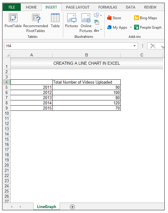
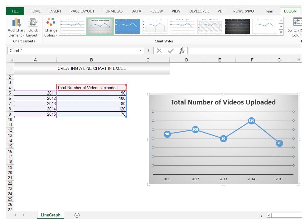
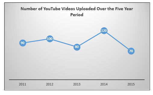
一位社会媒体营销人员正在评估他的公司在五年内上传到YouTube的视频数量。 他决定用折线图来展示数据,因为各年的间隔是相等的。
源数据显示如下。
如何在Excel中制作单线图(一步一步来)。
# 创建折线图
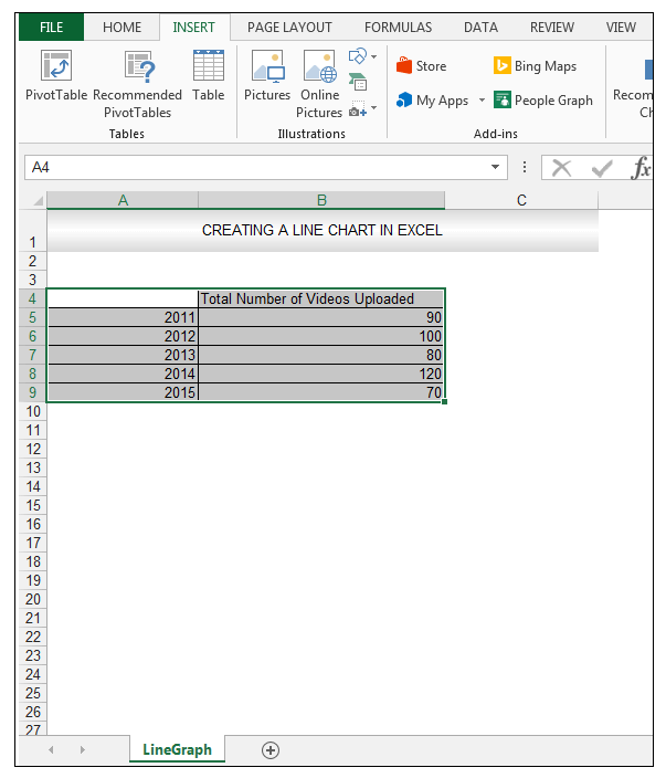
1) 首先,选择需要的数据,如下图所示。
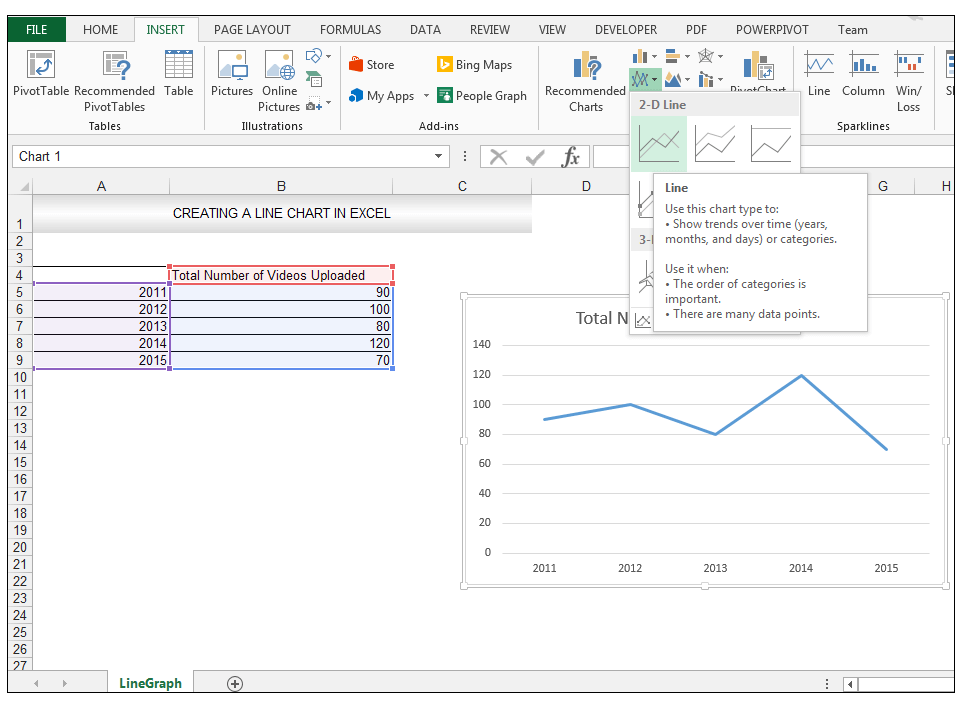
2) 转到 插入 > 图表 >点击"> "旁边的下拉箭头。 线形图 并选择 2-D线 ,线,如下图所示。
See_also: 如何删除Excel中的数据验证限制(3种方法)
阅读更多。 如何在Excel中用2个变量制作线形图(快速步骤)?
# 设置折线图的格式
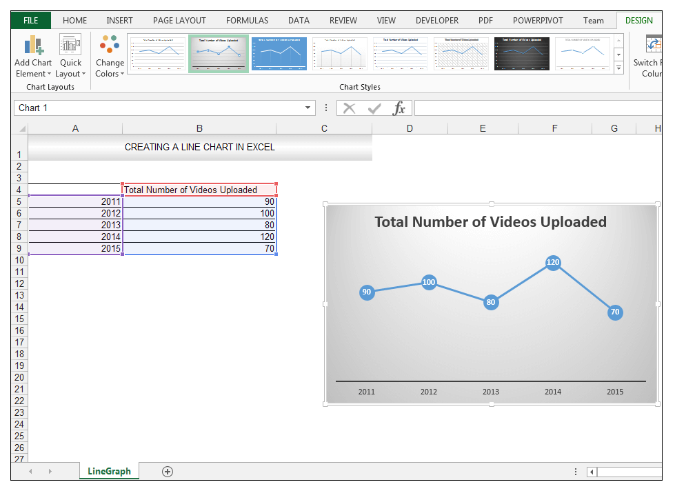
3) 选定图表后,转到 图表工具 > 设计 > 图表样式 并选择 图表样式2 如下图所示,为了快速 格式化的图表 .
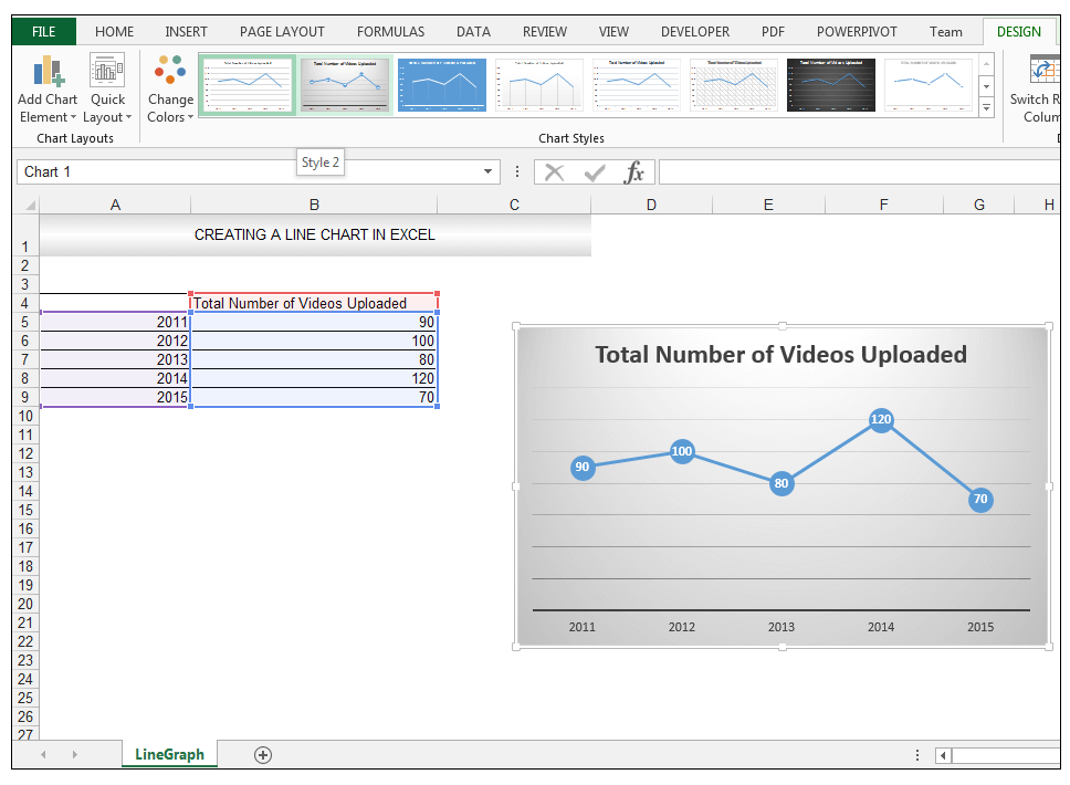
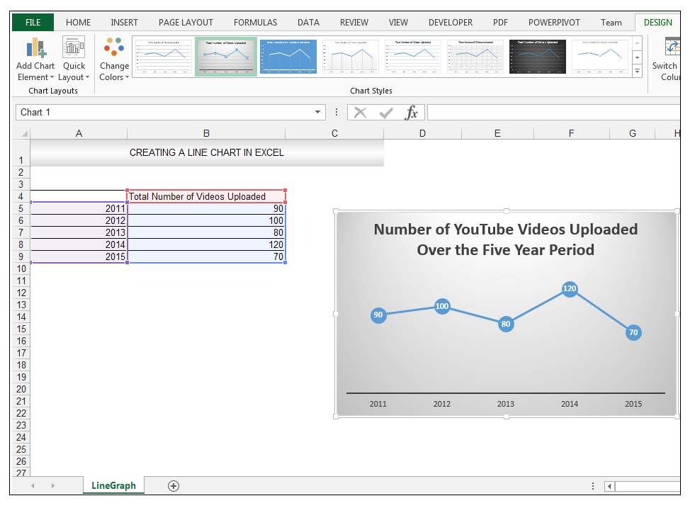
4) 选择网格线,如下图所示,然后按删除。
5) 选择 图表标题 和类型 五年间上传的YouTube视频的数量 .
6) 选择 图表标题 并减少字体大小,通过进入 首页 > 字体 并将字体大小改为12。
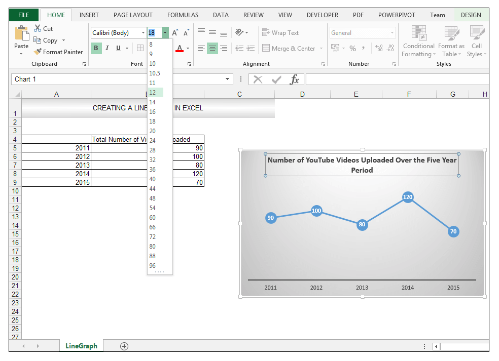
就这样,通过几个简单的步骤创建了一个折线图。
阅读更多。 如何在Excel中用3个变量制作折线图(含详细步骤)
下载工作文件
如何在Excel中制作铝线图
See_also: 如何改变Excel中的背景颜色(6种简单方法)
总结
线形图用于展示或显示一段时间内的趋势。 水平轴或类别轴是等距和等量的。 线形图的创建、格式和理解相当简单。
如果你在电子表格中广泛使用折线图,请随时评论并告诉我们。
Previous post VBA日期功能(宏的12种用途及示例)
Next post 如何在Excel的公式中引用工作表名称